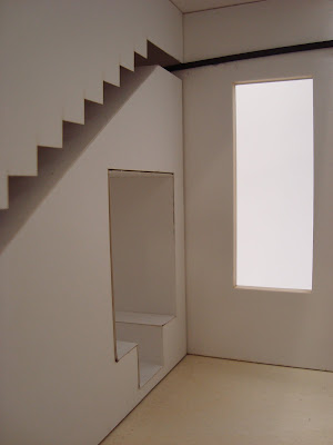
For Jenga 2.0, we were assigned a space from our previous assignment in which we were to add a top (or bottom) floor that was equal to 50 % of the previous space. The rules were that we had to incorporate a set of stairs (clearly), and that we would introduce either a wall, a column, or a solid.
The space that I was assigned from my previous project was the square space that was designed around the concept word joint, in which I emphasized two separate things fitting together and uniting. For this new space, I still focused it around the same idea, however my method of doing so differed from the first.
In the newly renovated space, I chose to make the staircase be the connecting aspect of the two separate solids. When not in use, the set of stairs would be stored in the solid to the left. Then when the stairs would be needed, they would pull from the wall and connect to another set of stairs that were part of the solid on the right.


Overall, from this project to last, I felt like my work and craftsmanship improved. But there of course are things that I still would like to work on. After critiquing Kara Kooy's work, I believe that next time I would use a similar approach that she used by incorporating hand renderings with digital. Although I attempting completing renderings for my presentation this time, I decided not to use them on my board because I was under the impression that the color had to stand out. But in Kara's example, she used simple black and white shading that turned out beautifully.

No comments:
Post a Comment